TextField prototype for Tiny Mobile Widgets
Text Field is composed of :
- a text layer (displays blank before text input, and the entered text after text input)
- a background frame that can be displayed depending on 'backgndColor' field
- a window border (around text layer) that has the same size than the text layer
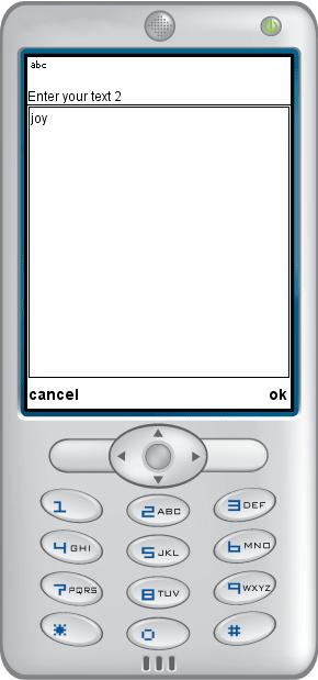
- a call to native window : displays the way of the device to enter text via keyboard (or virtual keyboard for touch screens)
Prototype can be activated/disabled through 'activate' boolean field for keyboard devices and through 'enabled' boolean field for touch screen devices.
The text displayed in text layer can be modified at anytime by user clicking into the textfield layer. It can also be modified from outside the prototype, by setting 'text' parameter.
The 'text' parameter providing current value of text is generated each time prototype modifies the text and can be accessed from outside the prototype.
Events
- SFString text - enable to read or write text displayed in Text Field from outside the proto
Text Box parameters
- SFInt32 maxChar - max number of characters, 0 for unlimited
- SFVec2f size - specify height and width of text layer
- SFVec2f translation - specify position of text layer
- SFColor borderColor - border color of the text box
- SFColor backgroundColor - background color into the textbox
- SFColor textColor - main text color
- SFBool activate - enable/disable Text field prototype
Touch parameter
- SFBool enabled - if true Touch sensor is enabled
Native text box management
Text labels used when displaying native text box
- SFString nativeTextBoxTitle
- SFString nativeTextBoxOkLabel
- SFString nativeTextBoxCancelLabel