TextField prototype
Text Field is composed of :
- a text layer
- a background (frame or picture) that can be displayed or not according to 'backgndChoice' field - frame or picture have exactly the same size and position
- a window border (around text layer) that can be displayed or not according to 'borderChoice' field
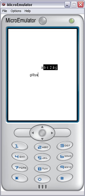
- a letters pad : window which displays set of T9 chars of the selected key ; letters pad is displayed as soon as key is pressed and for a defined timer (see TIME)
- a Mode window : displays the selected mode ("abc" "ABC" or "123") - mode window can be displayed/Not according to 'displayMODE' boolean eventIn
All these graphical elements constitutes the complete Text Field.
Prototype provides 2 parameters to the calling scene :
- Size of complete Text Field (smaller rectangle all graphical elements of Text Field including background even if not displayed)
- Position of center of TextField
Prototype can be activate/disable through 'isActiveTF' boolean field.
The text displayed in text layer can be modified at anytime by the calling scene using 'inputText' eventIn.
An output event ('outputTEXT') providing current value of text is generated each time prototype modify the text (either using text box or layer entering mode or setting a value to inputTEXT).
Text can be hidden at any time by calling scene (only '****' displayed - for example in case of password) using 'field SFBool displayTEXT' boolean field.
The native text box can be used to enter text - 2 modes are possible : 'automatic' or 'driven'.
- in automatic mode, native text box is automatically open by prototype each time user click on screen in TextField area ,
(Touch Sensor must be enabled ) text box is closed when user click on 'OK' or 'CANCEL' soft key, an eventOut is then generated ('backFromTextBox')
this mode can be activated/disabled using 'isActiveTextBox' boolean field
- in driven mode , native text box is open/closed by calling scene using 'openTEXTBOX' boolean field
When launching prototype, only size (x, y) of layer and number max of char are provided by developer to prototype.
Size and center position of complete Text Field is computed by prototype in initialize() from sizes and positions of each element.
Following sizes and positions are provided as constants in script Node:
- mode window Width and X or Y delta/ Background border,
- letters tab Width and X or Y delta/Background border,
- X and Y margins of Background / Layer
Height of elements 'mode window' and 'letters pad' are set to height of the used fonts (mode, letters) provided as parameters in proto interface,
Concerning layerSize :
- if parameterized Y value is < to the max of (text font height/cursor font height) Y value is automatically set to height of bigger of the 2 fonts
TouchSensor can be activated /disabled using 'isActiveTouchSensor' boolean
Events
- MFString inputTEXT - permit to modify text displayed in Text Field
- MFString outputTEXT - event generated each time text of Text field is modified
- SFBool openTEXTBOX false - if true and if displayTEXTBOX = TRUE => open system text box
- SFTime backFromTextBox - event generated when system text box is closed (OK or CANCEL)
- SFInt32 borderReached - event generated when the user wants to scroll upper the first line or lower the last line
-1 for upper and +1 for lower
-2 for left and +2 for right
- SFString TF_ID - ID to identify the textfield
- SFString requestTouchFocus - event generated when textfield is disable but a touch event has occurred
it contains the ID of the textfield
- SFTime doBackspace - event in to activate backspace/delete
Input/Output parameters
- SFBool lockMode FALSE - if TRUE, user can not change mode
- SFInt32 mode - key selection of mode
0 : abc lower case mode
1 : ABC upper case mode
2 : 123 numeric mode
3 : 0.2 decimal mode / lockMode off, displayMode off, '*' to delete and '#' to put the decimal point '.'
- SFInt32 displayMODE 2 - display key selection mode
0 : not displayed
1 : always displayed
2 : displays 1 seconds and disappear
Input parameters
- SFVec2f TFCenterPos - provide TF center position TF includes : text layer size + background
Input parameters
text input mode parameters "abc" "ABC" "123"
- SFVec2f modeTranslation - translation of mode display position ( by default TOP RIGHT )
- SFColor modeTextColor - color of text
- SFColor modeBackgndColor - color of background
- SFNode modeFont FontStyle - font node
text input choice parameters
- SFVec2f lettersTranslation - translation of letters choice position ( by default TOP RIGHT )
- SFColor lettersBackgndColor - color of text
- SFColor lettersTextColor - color of background
- SFNode lettersFont (FontStyle) - font node
text background management
- SFInt32 backgndChoice - -1: nothing displayed / 0 = display background / 1 = display picture
- MFString backgndPictureUrl - url of background picture
- SFColor backgndFrameColor - color of background
border management
- SFInt32 borderChoice - 0 = display border / -1 hide border
- SFColor borderFrameColor - color of border
- SFBool borderCornerRadius - add round rectangle effect
main text parameters
- SFVec2f textLayerSize - specify height and width of text layer
- SFInt32 maxChar - max number of characters, 0 for unlimited
- SFInt32 numberOfLines - set the number of line, 1 line by default
- <= 0 for auto-adaptive according to textLayerSize
- > 1 to fix the number of lines
- SFBool displayTEXT - true : text is displayed / false : password mode, only stars '*' are displayed
- SFBool isActiveTF - enable/disable Text field prototype; if true : cursor is flashing and typing is authorized
- SFColor textColor - main text color
- SFNode textFont - main text font node, when using multiline, only use "TOP" "LEFT"
grab focus
touch parameter
- SFBool isActiveTouchSensor - if true Touch sensor is enabled
native text box management
- SFBool isActiveTextBox - if true system text box is active and can be open
- either by calling scene thru openTEXTBOX eventIn
- or by click on TSENSOR_AREA if Touch sensor is enabled
text labels used when displaying native text box
- SFString nativeTextBoxTitle
- SFString nativeTextBoxOkLabel
- SFString nativeTextBoxCancelLabel